
Home Page Layout Tips and What to Avoid
Your home page likely gets the most amount of visits out of any other page on your website, so you want to prioritize the design and content of your home page layout above anything else.
That’s because, when someone lands on your website for the first time, you have 50 milliseconds to make a good first impression or they will be on to the next to find the information they are looking for.
You might hear this number called a “bounce rate.” A bounce rate is the number of people who land on a specific page on your site and then leave before clicking on anything else. You want a low bounce rate and a high click-through rate. This metric tells you whether people are engaging in your site and resonating with the content on the page.
From an SEO standpoint, you want people to stay on your website for as long as possible, so thinking through their customer journey and what they are likely to click through on any given page is essential to getting that bounce rate down.
Let’s find out- are you encouraging your website visitors to explore beyond your home page, or are you making these fatal mistakes?
What to Avoid on Your Home Page
Social Links in Your Main Navigation
Not to be dramatic, but every time I see this on a small brand’s website, I want to send them an email and urge them to immediately take it off!
Think about it. You JUST got someone on to your website and then you want to distract them by sending them off of your website and onto your social media platforms which may or may not be the most up to date.
I get that you may want to grow your Instagram following but it’s a big no for me.
These social links are totally fine to include in the footer of your website because likely a person has already scrolled through your website a bit by the time they see these.
Unclear Calls to Action (or none at all!)
Ideally, you should have one clear call to action above the fold on your home page. “Above the fold” is the part of your website that shows before a user starts scrolling down- aka the most important real estate on your home page.
Your call to action in this section should link to the primary goal of your website. Do you want people to book a call with you? View your portfolio? Fill out your contact form? View your services?
Whatever your highest money generating goal is, add that link to a button in your hero section with clear and descriptive text.
I often see designers and business owners add cutesy text to their website buttons and links and I get that you want to instill some personality. Button text like “there’s a surprise waiting for you” (creepy) or “talk to the hand” (rude) is vague and confusing and doesn’t make me want to click.
You can add personality elsewhere on your website!
Instead, your buttons should be clear and concise so that people know what they are getting into when they click it, otherwise they will avoid that button like the plague!
Clear Button Call to Action Examples
Here’s a few call to action examples for your buttons you can use instead:
Sign-Up for the Free Training
Book a Free Call to Learn More
Check Out My Recent Work
A Boring List of What You Have to Offer
Most businesses have more than one product or service they want to promote on their website.
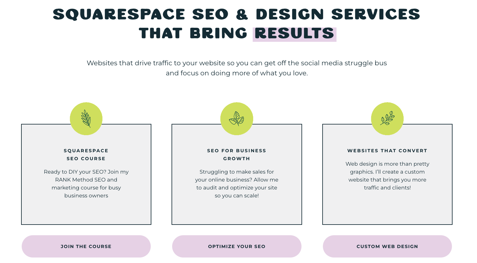
My advice as an web designer that specializes in SEO is to keep the list of services on your website to a minimum. 2-4 is a good number. Any more than that and you leave people confused (again) about what to click on first.
You also want to make sure to include a short description, no more than 1 or 2 sentences, about what each product or service is about.
Notice on my website that I have 3 services listed out side-by-side, so people can easily compare my SEO course, SEO Services, and Web Design Services with a short description and clear button text where people get sent to a unique service or sales page for that specific offer. Save the more in-depth explanations for those pages.
Inconsistent Branding
Your home page is the first impression people get of your business and having inconsistent branding can be confusing to potential customers.
Ideally, your branding should match across all of your online platforms meaning that you use the same fonts, colors, and patterns across your blog, Instagram, Pinterest, and so on.
If you’re not in a position to afford a custom brand, here is my advice- less is more!
Use no more than 2-3 main colors on a given page of your site. This will prevent website visitors from the visual overwhelm and disorientation that sometimes happens when there is too much going on.
The same goes for fonts. I like to use 2 main fonts- one for the headings and one for the body or paragraph font. And if you absolutely need to have a third, use it sparingly, as an accent. You also want to make sure all fonts are easy to read with adequate spacing and color contrast so that users don’t have to squint to read them.
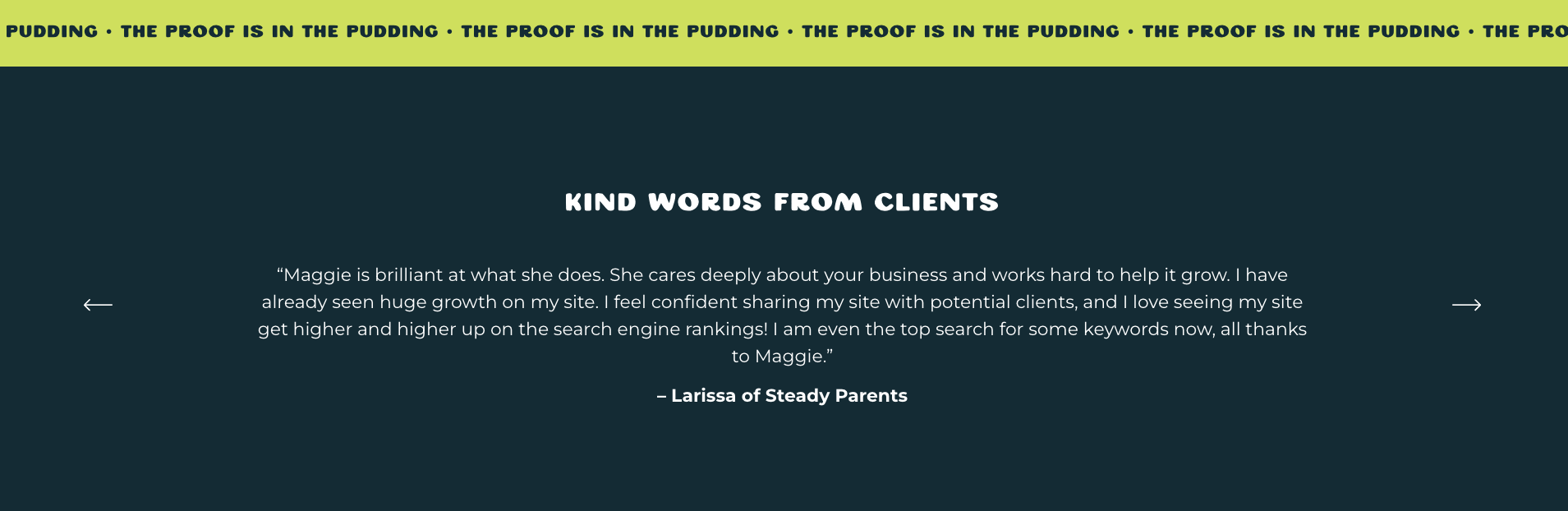
Lack of Social Proof
Social proof is important for building that instant credibility for those who are just entering your online world.
While most people think of testimonials or reviews written by past clients, social proof can include any of the following:
Testimonials
Reviews (including reviews pulled from platforms like Yelp, Google, Trip Advisor, Angie’s List)
Case Studies
Certifications (definitely include a logo or graphic from the accrediting institution for that immediate visual recognition)
Endorsements from friends or public figures
Awards
Media mentions
It may be hard to acquire testimonials when you're just getting started, but even a screenshot of an excited client's text message can help build that instant trust and credibility.
And don’t forget, the ultimate goal is to move website visitors further in their customer journey towards working with you so social proof is beneficial for building trust and increasing that feeling of FOMO (fear of missing out).
There have even been psychological studies about the power of social proof in helping move an individual out of indecision to “follow the crowd” so you don’t want to skip this piece on your homepage.
Don’t fret if gathering testimonials makes your cringe. Most people understand the value of a good review and are more than willing to help.
And you’ll be able to use this feedback to improve your processes and across all of your marketing efforts!
I have a great blog post about how to get glowing reviews from your clients you can find here.
This last mistake to avoid on your home page is my personal favorite one to call out…
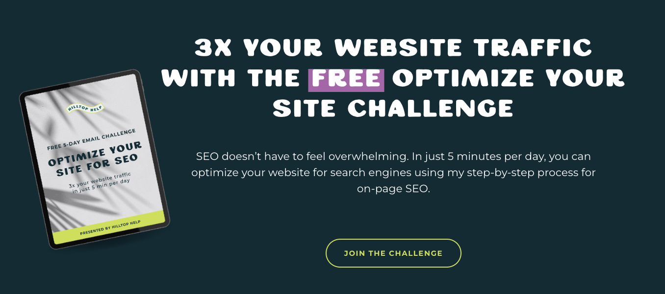
Having a Boring Email Opt-In
I guess having a boring email opt-in is better than no email opt-in but really how likely are you to sign-up for an email newsletter when you’re not even sure what you’re getting out of it?!
Getting website traffic onto your email list should almost always be a goal of your website but you don’t have to overcomplicate it!
Show a mock-up of the freebie they'll get or explain the transformation that will happen after they take your quiz or email challenge. People will be much more willing to give you their email address if there is something in it for them.
If you’re making any of these home page mistakes it may be time to give your website a refresh. You can make the process more simple by hiring a designer or purchasing a template from a reputable shop!
How to Structure Your Homepage Section By Section
Structuring your homepage effectively is crucial for engaging visitors and guiding them through key information about your brand, products, or services. Here’s a guide to structuring your homepage section by section, including what each section needs to achieve your business goals:
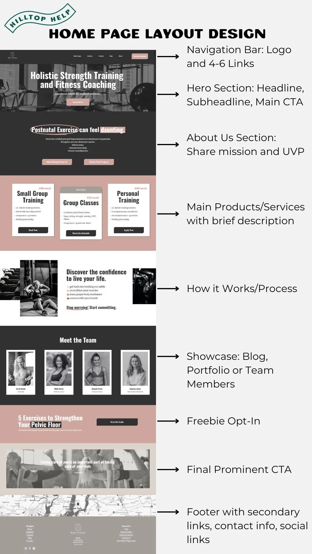
Header Section
This section is also called your navigation bar and while it is typically present throughout all of the pages on your website, you definitely want to make sure this section is optimized so that when visitors land on your homepage, they are guided in the right direction. Here’s what you need.
Logo
The most common place for your company logo is at the top left of the page, though you do have the option of having it in the center or in the top right corner. This allows for immediate brand recognition and most visitors know that by clicking the logo on any other page, they will be taken back to the home page.
Make sure your logo has a transparent background and isn’t blurry! Nothing screams unprofessional more. You can find Squarespace logo sizing guidelines here.
Navigation Menu
Include a clear and concise navigation menu with essential links like Home, About, Products/Services, Blog, Contact. I recommend no more than 6 links in your header navigation menu because too many options can be confusing.
Call-to-Action (Optional)
Consider adding a primary CTA button in the header section, such as "Get Started" or "Book a Call" depending on your main goal. The color of this button should be a contrasting color so it stands out.
Hero Section
The hero section of a website is the large, prominently displayed area that appears at the top of the home page and above the fold, or before scrolling down to view the rest of the page. Here are the must haves of this section:
Hero Image/Video
Use a captivating image or video that represents your brand or showcases your products/services.
Headline
Include a compelling headline that grabs attention and communicates your unique value proposition (UVP) or main message. This text should only be a line or two and users should be able to read it quickly to determine what your business does and who it does it for.
Subheadline
Provide a brief supporting statement or subheadline that reinforces the headline and clarifies your offering.
Primary Call-to-Action (CTA)
Place a prominent CTA button that encourages visitors to take action, such as "Shop Now," "View the Portfolio”
About Us Section
Introduction
Share a concise and engaging introduction about your company, highlighting its mission, values, and unique selling points. Depending on whether you are a solopreneur or a larger company you may also want to include the following.
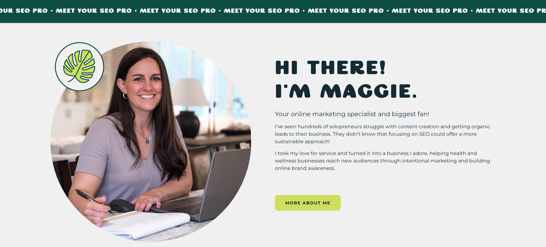
Team or Founder Story (Optional)
Include a brief section introducing key team members or sharing the founder's story to add a personal touch. A headshot of the owner would go a long way here because people love to put a face to the name of the business.
Company Achievements or Milestones (Optional)
Showcase notable achievements, awards, or milestones to build credibility and trust. This could look like a collection of logos of big name brands and companies you have provided a service.
Products/Services Section
Product/Service Highlights
Feature key products or services with high-quality images and brief descriptions. I like to keep the pricing on the actual service page so that people can learn a bit more about your offers before quickly jumping ship if they deem the price too high. Again, limit this section to 2-4 offer highlights or categories, even if you have more.
Testimonials
Here’s where you can include that essential social proof. Include customer testimonials or reviews to provide social proof and build trust. You can even add a Google widget if you want to pull reviews automatically from your Google Business Profile.
How It Works or Process Section
Use visual elements like icons or illustrations to explain how your product or service works in a simple and easy-to-understand format. What does it look like for someone to work with you?
Reinforce the benefits of using your product or service at each step to demonstrate value and simplicity!
Blog or Portfolio Section
If you have a blog, showcase your latest or featured blog posts to provide valuable content and encourage visitors to explore further. Posting valuable blog content is not only good at positioning yourself as an expert in your field, but also great for SEO!
Google loves when you are regularly updating your website and having a blog gives people more opportunity to spend time on your site.
You may want to organize blog posts into categories or topics for easy navigation and discovery.
If you are a visual service provider such as a photographer or florist with a portfolio, you may want to move this section up a bit higher on the homepage to showcase the beauty of your work.
Contact Section or Final Call to Action
Include a contact form that allows visitors to send inquiries or messages directly from your homepage. This is where you may want to put that email newsletter opt-in if you don’t want a contact form on your home page.
Whichever you choose, make sure your final call to action on your home page is clear and concise and reflects the main purpose of your website.
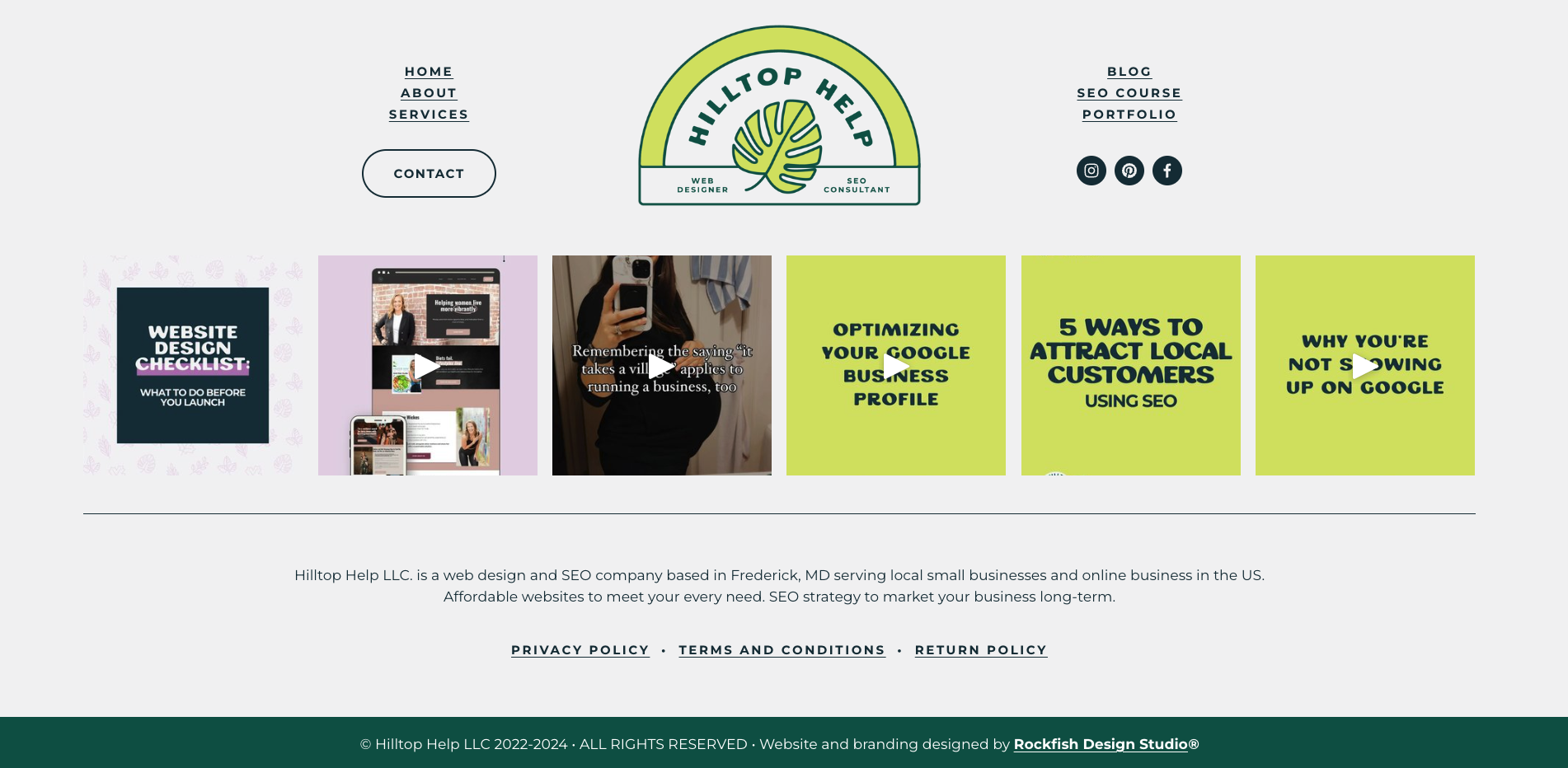
Footer Section
Your footer section is an overlooked part of your homepage and an SEO goldmine! Make sure to include the following while keeping the design clean and straightforward.
Include secondary links, legal information (like privacy policy and terms of service), and social media icons in the footer.
Add a copyright notice and year to protect your content and to show Google that your business website is updated regularly.
If you have any site credits to include, such as your web designer, brand designer, or photographer, you can also include those links in the footer.
Your home page layout is the most crucial for your entire website as it is the most visited page on your site.
Remember to maintain a clean and uncluttered design, use consistent branding elements throughout the page, and ensure that the content is concise, engaging, and easy to scan. If you have any of the home page mistakes mentioned above, make sure to update them asap!
Regularly review and optimize your homepage based on user feedback and performance metrics to improve user experience and achieve your business goals.
Pin this for Later:


Browse the Blog: